Bitnova UI SDK Documentation
BitnovaUI is a premium WinForms SDK with 50+ fully custom-painted controls, a unified theming engine, 60fps animations, data binding, fluent validation, and 6 built-in chart types. Zero external dependencies. Targets .NET 8, .NET 9, and .NET Framework 4.6.2 / 4.7.2 / 4.8.
net462, net472, net48, net8.0-windows, and net9.0-windows from a single DLL. BitnovaButton gains a new Gradient variant with fully customisable colours and angle.
Architecture overview
Every control inherits from BitnovaBase, which extends Control with double-buffered rendering, automatic theme subscription, and the Draw utility for anti-aliased GDI+ paths. The BitnovaTheme static class holds all colour tokens and fires ThemeChanged whenever the mode or preset changes — controls repaint automatically.
// Namespace layout
Bitnova.UI            // BitnovaTheme, BitnovaBase, Draw, BitnovaAnimator
Bitnova.UI.Controls   // all visual controls (Button, TextBox, DataGrid …)
Bitnova.UI.Charts     // Line, Area, Bar, Pie, Radar, Bubble
Bitnova.UI.Binding    // BitnovaBindingEngine
Bitnova.UI.Validation // BitnovaValidation, FieldValidator
Bitnova.UI.Licensing  // LicenseManager (design-time only)
Requirements
| Requirement | Detail |
|---|---|
| .NET version | .NET 8 or .NET 9 (Windows) or .NET Framework 4.6.2 / 4.7.2 / 4.8 |
| Framework | Windows Forms (UseWindowsForms: true) |
| OS | Windows 7 SP1+ (Framework) / Windows 10 1903+ (net8/net9) |
| IDE | Visual Studio 2022 17.8+ or Rider 2024+ |
| Dependencies | None — pure GDI+ / BCL only on all targets |
Installation
Add compiled DLL reference
// Right-click project → Add → Project Reference → Browse
// Select: Bitnova.UI.WinForms.dll

// Or add a ProjectReference in your .csproj:
<ProjectReference Include="path\to\Bitnova.UI.WinForms.csproj" />
Register controls in the Toolbox
Right-click the Toolbox → Choose Items → Browse → select the DLL. All Bitnova controls appear in a Bitnova UI tab automatically. Drag any control onto your form and it renders immediately with its default styled appearance.
Global usings (optional)
global using Bitnova.UI;
global using Bitnova.UI.Controls;
global using Bitnova.UI.Charts;
Multi-target note
The same DLL targets all five frameworks. No conditional compilation or separate packages are needed in consuming projects — MSBuild selects the correct TFM automatically.
Quick Start
using Bitnova.UI;
using Bitnova.UI.Controls;

public class MainForm : Form
{
    public MainForm()
    {
        // 1. Set theme once, before controls are created
        BitnovaTheme.SetMode(ThemeMode.Dark);
        BitnovaTheme.SetPreset(ThemePreset.Indigo);
        BackColor = BitnovaTheme.Background;

        // 2. Standard filled button
        var btn = new BitnovaButton
        {
            Text    = "Save Changes",
            Variant = ButtonVariant.Filled,
            Location= new Point(24, 24)
        };
        btn.Click += (s, e) =>
            BitnovaToast.Show(this, "Saved!", ToastType.Success);

        // 3. Gradient button
        var gradBtn = new BitnovaButton
        {
            Text               = "Premium Action",
            Variant            = ButtonVariant.Gradient,
            GradientStartColor = Color.FromArgb(99, 102, 241),
            GradientEndColor   = Color.FromArgb(236, 72, 153),
            GradientAngle      = 135f,
            Location           = new Point(24, 72)
        };

        Controls.AddRange(new Control[] { btn, gradBtn });
    }
}
Theming Engine
All colour tokens live in BitnovaTheme. Changing mode or preset fires ThemeChanged — every control repaints automatically with no extra code.
Theme modes
BitnovaTheme.SetMode(ThemeMode.Dark);
BitnovaTheme.SetMode(ThemeMode.System); // follows Windows setting
Colour presets
BitnovaTheme.SetPreset(ThemePreset.Teal);

// Custom brand colour (overrides preset primary)
BitnovaTheme.SetBrandColor(Color.FromArgb(0, 120, 212));

// Change font family globally
BitnovaTheme.SetFontFamily("Segoe UI Variable");
Key colour tokens
| Token | Light | Dark | Use |
|---|---|---|---|
| Primary / PrimaryLight / PrimaryDark | #6366f1 family | Buttons, accents, focus rings | |
| Background | #f5f5ff | #080812 | Form/window background |
| Surface / SurfaceAlt | #ffffff | #1a1a3a | Cards, panels, inputs |
| TextPrimary / TextSecondary / TextDisabled | semantic hierarchy | Labels, captions, disabled | |
| Border / BorderFocus / BorderStrong | indigo-tinted | All control borders | |
| Success / Danger / Warning / Info | semantic colours | Alerts, badges, status | |
Licensing
BitnovaUI uses a developer licence model. The licence governs your right to use the SDK to build software — it has absolutely no effect on the end users of applications you ship.
How it works
| Context | Behaviour |
|---|---|
| Visual Studio designer | Controls check for a valid activation on the developer's machine. Unlicensed installs show a watermark overlay in the designer and prompt once per VS session. |
| Built / shipped app | Complete no-op. BitnovaCore.Initialize() returns immediately. No file I/O, no network, no dialogs, zero overhead. |
Activation API
| Method | Returns | Description |
|---|---|---|
| SetApiUrl(url) | void | Override the activation endpoint (call once at startup) |
| IsLicensedForDesign() | bool | Checks local cache — no network call |
| ActivateAsync(key) | Task<(bool,string)> | Online activation, saves HMAC-signed cache on success |
| RevalidateAsync() | Task<bool> | Daily heartbeat — skipped if validated recently |
| DeactivateAsync() | Task<(bool,string)> | Frees an activation slot on the server |
| GetMachineId() | string | SHA-256 hardware fingerprint (registry-based, HMAC-signed cache) |
// Standard filled button
var btn = new BitnovaButton
{
    Text       = "Submit",
    Variant    = ButtonVariant.Filled,
    ButtonSize = ButtonSize.Medium,
    Loading    = false
};

// Gradient button
var g = new BitnovaButton
{
    Text               = "Buy Now",
    Variant            = ButtonVariant.Gradient,
    GradientStartColor = Color.FromArgb(99,102,241),
    GradientEndColor   = Color.FromArgb(236,72,153),
    GradientAngle      = 135f
};
ButtonVariant
Properties
| Property | Type | Default | Description |
|---|---|---|---|
| Variant | ButtonVariant | Filled | Visual style variant |
| ButtonSize | ButtonSize | Medium | Small (30px) / Medium (38px) / Large (48px) |
| GradientStartColor | Color | Primary | Start colour for Gradient variant |
| GradientEndColor | Color | PrimaryDark | End colour for Gradient variant |
| GradientAngle | float | 135 | Gradient direction in degrees |
| Loading | bool | false | Shows spinner, disables clicks |
| IsDisabled | bool | false | Applies DisabledState styling and blocks clicks |
| BorderRadius | int | 8 | Corner radius in pixels |
| AllowAnimations | bool | true | Hover/press colour transitions |
| AnimationSpeed | int | 160 | Transition duration in ms |
| IdleState / HoverState / PressedState / DisabledState | BitnovaStateStyle | — | Per-state fill, border, fore, radius overrides |
| Badge | BitnovaBadgeStyle | — | Corner badge / counter overlay |
var tb = new BitnovaTextBox
{
    Label       = "Email Address",
    Placeholder = "you@example.com",
    PrefixText  = "✉",
    IsPassword  = false
};
tb.ErrorText = "Invalid email format"; // shows red error
| Property | Type | Description |
|---|---|---|
| Label | string | Animated floating label |
| Placeholder | string | Hint text when empty |
| ErrorText | string | Red error below; empty = no error |
| HelperText | string | Subtle helper text below |
| PrefixText / SuffixText | string | Static text adornment |
| PrefixIcon / SuffixIcon | Image | Icon adornment |
| IsPassword | bool | Masks with toggle eye icon |
| ReadOnly | bool | Non-editable display mode |
| IsDisabled | bool | Fully disables field with DisabledState style |
| MaxLength | int | Max input character count |
| CharacterCasing | CharacterCasing | Normal / Upper / Lower |
var cb = new BitnovaComboBox { Label = "Role" };
cb.Items.Add("Admin"); cb.Items.Add("Editor"); cb.Items.Add("Viewer");
cb.SelectedIndex = 0;
cb.SelectedIndexChanged += (s, e) => Console.WriteLine(cb.SelectedItem);
var dp = new BitnovaDatePicker
{
    Label      = "Start Date",
    Value      = DateTime.Today,
    DateFormat = "dd MMM yyyy"
};
dp.ValueChanged += (s, e) => Console.WriteLine(dp.Value);
var hs = new BitnovaHSlider
{
    Minimum = 0, Maximum = 100, Value = 50,
    ElapsedColor = BitnovaTheme.Primary,
    ShowValue    = true,
    ShowTicks    = true, TickCount = 5
};
hs.ValueChanged += (s, e) => label.Text = hs.Value.ToString("F0");
var toggle = new BitnovaToggle { Text = "Dark Mode" };
toggle.CheckedChanged += (s, e) =>
    BitnovaTheme.SetMode(toggle.Checked ? ThemeMode.Dark : ThemeMode.Light);

var radio = new BitnovaRadio  { Text = "Pro Plan",  Checked = true };
var chk   = new BitnovaCheckBox{ Text = "I agree",  ThreeState = false };
var card = new BitnovaCard
{
    Elevation    = 2,
    BorderRadius = 12,
    CardColor    = Color.Empty, // Empty = theme Surface
    Hoverable    = true
};
card.Controls.Add(myLabel);
var pnl = new BitnovaPanel
{
    PanelStyle      = PanelStyle.Gradient,
    PanelColor      = Color.FromArgb(99,102,241),
    PanelColor2     = Color.FromArgb(79,70,229),
    GradientMode    = GradientMode.Vertical,
    BorderRadius    = 14
};
var pages = new BitnovaPages
{
    TransitionType     = PagesTransition.Fade,
    TransitionDuration = 300
};
pages.SetPage(2);             // by index
pages.SetPage("analytics");  // by Name or Text
pages.NextPage();            // advance one
var sidebar = new BitnovaSidebar
{
    AppName = "My App",
    Dock    = DockStyle.Left
};
sidebar.AddItem("Dashboard", "⌂");
sidebar.AddItem("Users",     "👥", badge: "12");
sidebar.AddSeparator();
sidebar.AddItem("Settings",  "⚙");
sidebar.SelectedChanged += (s, idx) => pages.SetPage(idx);
public class MainForm : BitnovaWindow
{
    public MainForm()
    {
        Text           = "My Application";
        Subtitle       = "v2.0";
        CornerRadius   = 10;
        TitleBarHeight = 48;
        ShowDarkToggle = true;
    }
}
var ib = new BitnovaIconButton
{
    IconStyle           = IconButtonStyle.Round,
    BackgroundColor     = BitnovaTheme.Primary,
    ColorContrastOnHover = 28,
    Size                = new Size(44, 44)
};
var pic = new BitnovaPictureBox
{
    Shape       = PictureShape.Circle,
    BorderColor = BitnovaTheme.Primary,
    BorderWidth = 2,
    HoverZoom   = true,
    Size        = new Size(80, 80)
};
var grid = new BitnovaGrid
{
    PageSize       = 12,
    ShowCheckboxes = true,
    ShowSearch     = true,
    StripedRows    = true,
    Dock           = DockStyle.Fill
};
grid.AddColumn("avatar", "",      60,  GridColumnType.Avatar);
grid.AddColumn("Name",   "Name",  180, GridColumnType.Text);
grid.AddColumn("Status", "Status",100, GridColumnType.Status);
grid.AddColumn("prog",   "Usage", 140, GridColumnType.Progress);

// Load from DataTable
grid.LoadDataTable(myDataTable);

// Export to CSV
grid.ExportCSV("export.csv");
Events: RowClicked, RowDoubleClicked, SelectionChanged
var pb = new BitnovaProgressBar
{
    Value          = 60,
    Orientation    = Orientation.Horizontal,
    FillColorLeft  = BitnovaTheme.Primary,
    FillColorRight = BitnovaTheme.Secondary,
    ShowLabel      = true
};
pb.TransitionValue(85, durationMs: 1200);  // animated
pb.Indeterminate  = true;                 // loading mode
pb.Striped        = true;                 // diagonal stripes
var loader = new BitnovaLoader
{
    Style       = LoaderStyle.Ring,
    LoaderColor = BitnovaTheme.Primary,
    Thickness   = 3f
};
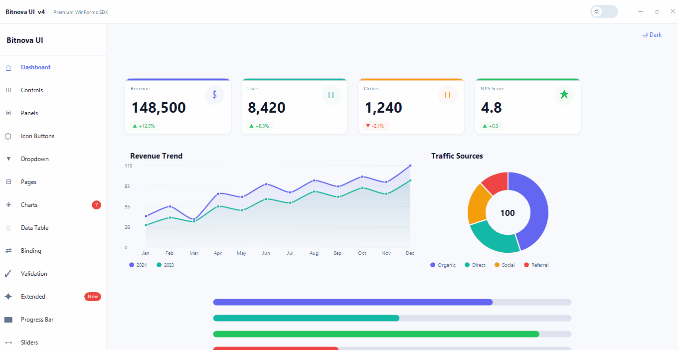
var card = new BitnovaStatCard
{
    CardTitle   = "Total Users",
    Value       = "8,420",
    Change      = "+12.5%",
    IsPositive  = true,
    Icon        = "👥",
    AccentColor = BitnovaTheme.Primary
};
card.AnimateValue(from: 0, to: 8420, format: "N0");
var gauge = new BitnovaGauge
{
    Min       = 0, Max = 100,
    Value     = 67,
    Unit      = "%",
    Label     = "CPU Usage",
    GaugeColor= BitnovaTheme.Primary
};
The gauge auto-colours: above 85% → Danger, above 65% → Warning, otherwise the set GaugeColor.
BitnovaCharts — Overview
Six chart types, all animated, theme-aware, with legends, tooltips, and multi-series support. No third-party charting dependencies.
| Class | Use case |
|---|---|
| BitnovaLineChart | Trends over time, multi-series, smooth Bézier curves or sharp lines |
| BitnovaAreaChart | Line with gradient fill below the curve (FillArea = true) |
| BitnovaBarChart | Categorical comparisons, gradient bars, hover highlight |
| BitnovaPieChart | Part-of-whole; optional doughnut mode with centre total |
| BitnovaRadarChart | Multi-axis comparison (skills, profiles, metrics) |
| BitnovaBubbleChart | Three-dimensional data (X, Y, and size axes) |
Line & Area Charts
var chart = new BitnovaLineChart
{
    Title       = "Revenue Trend",
    SmoothCurve = true,
    FillArea    = true,
    ShowDots    = true,
    Animated    = true
};
var ser = new ChartSeries("2024", Color.FromArgb(99,102,241));
ser.Values.AddRange(new double[] { 42000, 58000, 74000, 91000 });
chart.SetLabels(new[] { "Jan", "Feb", "Mar", "Apr" });
chart.AddSeries(ser);
Bar Chart
var bar = new BitnovaBarChart { Title = "Quarterly Revenue", BarRadius = 6 };
bar.AddPoint("Q1", 42000); bar.AddPoint("Q2", 68000);
Pie / Donut Chart
var pie = new BitnovaPieChart
{
    Title       = "Market Share",
    IsDoughnut  = true,
    HolePercent = 60
};
pie.AddSlice("Windows", 72);
pie.AddSlice("macOS",   18);
pie.AddSlice("Linux",   10);
Radar Chart
var radar = new BitnovaRadarChart { Title = "Team Skills" };
radar.SetAxes(new[] { "Design", "Backend", "DevOps", "Testing" });
var rs = new ChartSeries("Alice", Color.FromArgb(99,102,241));
rs.Values.AddRange(new double[] { 90, 75, 60, 85 });
radar.AddSeries(rs);
Bubble Chart
var bubble = new BitnovaBubbleChart { Title = "Market Analysis" };
bubble.AddPoint(x: 10, y: 50, size: 30, label: "Product A");
bubble.AddPoint(x: 40, y: 85, size: 60, label: "Product B");
Extra Controls
BitnovaStarRating
var stars = new BitnovaStarRating
{
    MaxStars  = 5,
    StarSize  = 24,
    StarColor = Color.FromArgb(245,158,11),
    ReadOnly  = false
};
stars.RatingChanged += (s, e) => Console.WriteLine(stars.Value);
BitnovaChip
Compact dismissible tag pill with optional close button, selected state, and custom colour.
var chip = new BitnovaChip
{
    Text      = "Design",
    ChipColor = BitnovaTheme.Primary,
    Closable  = true
};
chip.Dismissed += (s, e) => chip.Parent?.Controls.Remove(chip);
BitnovaAlert
var alert = new BitnovaAlert
{
    AlertTitle = "Update available",
    Text       = "BitnovaUI v4.1 is now available.",
    AlertType  = ToastType.Info,
    Closable   = true
};
BitnovaTimeline
var tl = new BitnovaTimeline();
tl.AddItem(new TimelineItem
{
    Title       = "Project Kickoff",
    Description= "Requirements gathered.",
    Time        = "2 days ago",
    Status      = TimelineStatus.Done
});
BitnovaKnob (Knob Slider)
var knob = new BitnovaKnob
{
    Minimum   = 0, Maximum = 100, Value = 50,
    KnobLabel = "Volume",
    Unit      = "%",
    FillColor = BitnovaTheme.Primary
};
// Drag up/down or scroll wheel to change value
Animation System
BitnovaAnimator is a lightweight tween engine used internally by every control. Use it directly for custom animations.
// Float tween
BitnovaAnimator.Float(from: 0f, to: 100f, ms: 400,
    tick: v => { myValue = v; Invalidate(); },
    easing: Easing.EaseOutCubic);

// Color tween
BitnovaAnimator.Color(Color.Red, Color.Blue, ms: 300,
    tick: c => { myColor = c; Invalidate(); });
Easing functions
Data Binding
BitnovaBindingEngine syncs any control property to any INotifyPropertyChanged source with two lines of code.
var model  = new UserModel { Username = "Alice" };
var engine = new BitnovaBindingEngine();

// Two-way: control ↔ model
engine.Bind(txtName, "Text", model, "Username");

// One-way from model to control
engine.Bind(lblRole, "Text", model, "Role",
    direction: BindingDirection.OneWay);

// With converter + format string
engine.Bind(lblActive, "Text", model, "IsActive",
    converter: v => ((bool)v) ? "Active" : "Inactive");

engine.UnbindAll();
Validation
Fluent rule builder that wires errors directly into BitnovaTextBox ErrorText.
var v = new BitnovaValidation();

v.Field(txtEmail, "Email").Required().Email();
v.Field(txtPassword, "Password").Required().MinLength(8);
v.Field(txtPhone, "Phone").Phone();
v.Field(txtAge, "Age").Range(18, 99);

// Validate on submit — errors appear inside each TextBox automatically
if (!v.Validate().IsValid) return;

// Real-time mode — validate as user types
v.Field(txtSearch).MinLength(2).EnableRealtime();

v.ClearErrors();
Toast & Tooltip
// Toast — overlay notification, auto-dismisses after duration
BitnovaToast.Show(this, "Settings saved!",   ToastType.Success);
BitnovaToast.Show(this, "Connection failed", ToastType.Error);
BitnovaToast.Show(this, "Check your input", ToastType.Warning);
BitnovaToast.Show(this, "Processing…",      ToastType.Info, durationMs: 5000);

// Custom themed tooltip (attaches to any control)
var tip = new BitnovaTooltip();
tip.SetToolTip(myButton, "Click to save your changes");